We implemented Google’s Material 3 and Microsoft’s Fluent 2 design systems for QSkinny, as shown in the screenshots below (still an ongoing effort). This required some new features to be implemented, some of which hinted at new general paradigms within many other design systems.
Contrarily, some features often found in commercial design systems seem to have been deliberately left out of these two ‘generic’ ones above.
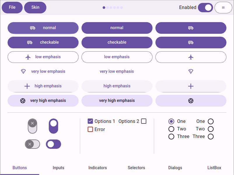 Google’s Material 3 design system
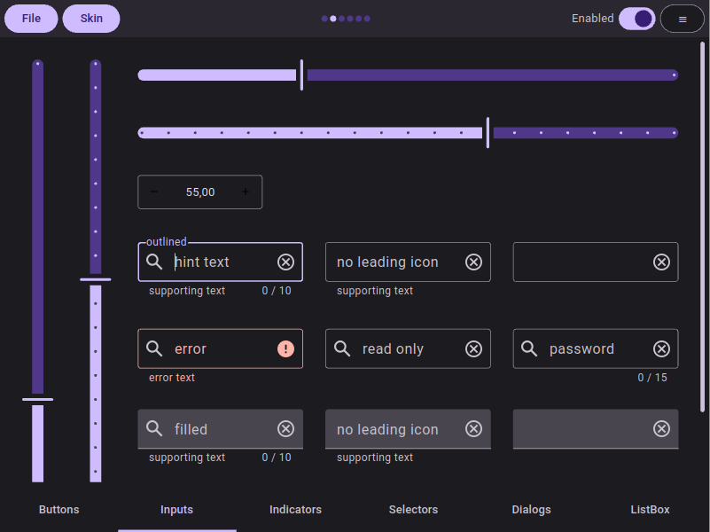
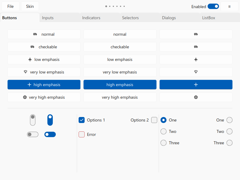 Microsoft’s Fluent 2 design system
Here is a subjective list of requirements for new design systems:
1. Subtle shadows everywhere
Of course the days of the 90s style thick drop shadows are gone, but apparently so is the complete flat style of the first iPhone. Shadows (and other ways of elevation) are used as a subtle way to draw attention and show levels of visual hierarchy.
For instance, a hovered or focused button will have a higher elevation than a resting button, and a dialog or a popup an even higher one. Typically these shadows have a minimal x/y offset, and a semitransparent color.
Material has a guide on elevation that lists shadows as one element, and colors as another one. Interestingly the usage of shadows in Material 3 was reduced in favor of coloring in comparison to its predecessor Material 2.
Fluent 2 similarly lists shadows and box strokes (i.e. box borders) as elements of elevation.
As a consequence, shadows should be 1st class citizens in UI toolkits: Defining a shadow on a control should be as easy as setting a color or a font.
Here is how QSkinny defines the gradient and shadow of the QskMenu class for Fluent 2:
    using Q = QskMenu;

    setBoxBorderColors( Q::Panel, pal.strokeColor.surface.flyout );
    setGradient( Q::Panel, pal.background.flyout.defaultColor );

    setShadowMetrics( Q::Panel, theme.shadow.flyout.metrics );
    setShadowColor( Q::Panel, theme.shadow.flyout.color );
Fluent 2 menus in QSkinny
Side note: Inner shadows (as opposed to drop shadows) seem to be very rare and have only been observed in sophisticated controls for commercial design systems.
2. Gradients are gone… or aren’t they?
Material 3 comes with an incredibly sophisticated color/palette system (see below); but surfaces like button panels etc. consist of one color only (Sometimes two colors need to be “flattened” into one, e.g. a semi-transparent hover color and an opaque button panel color).
Same for Fluent 2: The design system lists several shades of its iconic blue color and more flavors of gray without any gradient.
However, many commercial design systems still use gradients for “2.5D-style” effects. Of course they are applied as subtly as the aforementioned shadows, but are still being used a lot.
The QSkinny example below shows two small buttons on the left with subtle linear gradients (45 degrees) in the inner panel and a reversed gradient on the outer button ring. This has both an elevation and a “texture” effect without actually using textures (i.e. images). The shadows add to the depth, but even with only gradients would the sense of elevation still be there.
On the right is a gauge with conical gradients: The inner green one going from dark green to lighter green, and the outer one trying to mimic a chromatic effect. Radial gradiants are not shown here, but are equally usable.
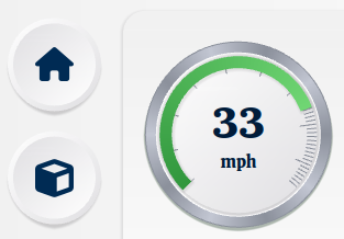
Gradients add depth and elevation
Outlook: For more sophistication there might be the need in the future of multi-dimensional gradients like the one below: a conical gradient (from purple to blue) and a radial one (transparent to full hue):
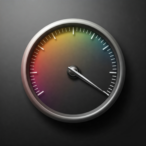
A gauge generated by AI showing multi-dimensional gradients
3. Those modern palettes aren’t what they used to be
Google created a new color system called HCT (hue, chroma, tone) built on older ones like HSL (hue, saturation, lightness). The difference is that HCT is “perceptually accurate”, i.e. colors that feel lighter are actually recognized as lighter within HCT with a higher tone value.
By changing only the chroma (~ saturation) and tone (~ lightness) of a color, one can generate a whole palette to be used within a UI that matches the input color nicely; as an example, see the Material 3 palette on Figma.
In terms of accessibility, by choosing e.g. background and font colors with a big tone difference, one can be reasonably sure that text is comfortly legible.
So even developers without design experience can create a visibly appealing UI, without even knowing the main input color. Creating the palette depending on an input color is used on e.g. Android, where the user can choose a color or just upload an image, and all controls adapt to the main color.
Side note from the Qt world: QColor::darker() and QColor::lighter() are not fine-grained enough for this purpose.
With the additional support of changing colors dynamically (see below), this means that palettes can easily be generated for both day and night mode from one or two input colors; one could also easily change between different brand colors.
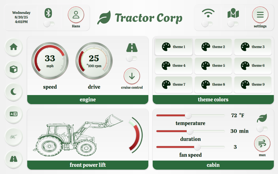
The QSkinny tractor example shows how to extend the Material 3 palette with more colors and how to change between day/night mode as well as different brands easily, as switching colors and other hints is supported directly in the framework.
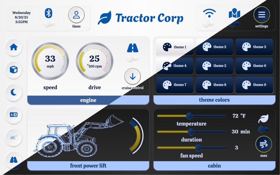 QSkinny tractor example in day/night mode with “Ikea colors”
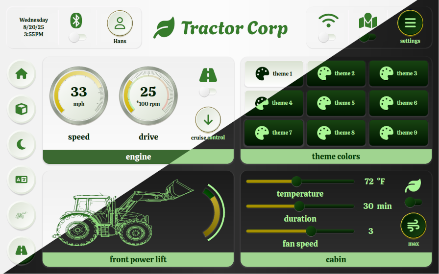 QSkinny tractor example in day/night mode with “John Deere colors”
For an online demo of this app, see the tractor example on the main page.
So while changing between branding themes as above might not be a day-to-day use case, changing between day and night mode certainly is. This means that a UI toolkit should be able to change skin colors dynamically.
Note: Ideally not only colors can be changed, but any type of skin definition like box roundings, fonts etc. QSkinny treats every definition token, or so called “skin hint”, the same and can therefore exchange any of those at runtime.
4. Graphics: Write once, change all the time
Graphics like the button icons and the bigger tractor icon in the example above should be flexible in several ways:
They should adapt to color changes, as they are typically part of a definition that might change with the current skin; i.e. if the font and background colors change, then so need the icons.
Equally important, they should be flexible in size. With the Material 3 skin, e.g. buttons can have a different size in pixels depending on the physical size of the screen used: On smartphones that have a high resolution and a low physical size, buttons tend to have a bigger size in pixels than on tablets or TVs. This means that also the icons might have to grow with the buttons; when using layouts, they might even have to grow dynamically at runtime when resizing a window.
For the use case of different physical sizes, Material 3 supports so-called “density-independent pixels”; Fluent 2 has a similar concept named “device-independent pixels”.
These two points of course hint at using raster graphics like SVGs rather than JPGs/PNGs for icons; at least in Qt they have made kind of a revival recently.
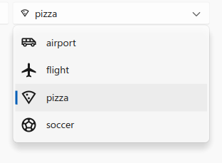
In QSkinny flexible graphics have been supported from the start, and fit nicely with the use of icons in Material 3 and Fluent 2.
Lastly, at some point those graphics might also need to be animated with e.g. lottie. Material 3 and Fluent 2 don’t seem to have an urgent need for this, but other design systems might have this requirement.
5. Conclusion
Implementing Material 3 and Fluent 2 for QSkinny was a painful but solid way to future-proof our UI toolkit.
Modern toolkits should be following the paradigms of modern design systems: They should allow for easy definition of shadows, or generally speaking: They should allow for styling all aspects of a “box” like gradients, border colors, box shapes, and shadows.
In addition they should allow for dynamically changing all aspects of the current style like colors, fonts and the aforementioned box aspects.
Talking in QSkinny terms, we believe that styling aspects of boxes and changing skin hints dynamically is well covered after having implemented bot Material 3 and Fluent 2.
Of course there is more work to do when it comes to more advanced features for other design systems like inner shadows, multi-dimensional gradients or multiple shadow colors.
6. Quiz
Can you guess the “brand” from the colors being used in the screenshot below? Let me know and the first one to get it right will receive a drink of his/her choice next time we meet in person!
 Which brand do these colors belong to? Hint: It is not really a company.